How to Improve Landing Page Optimization for Ecommerce Brands

Averi Academy
Averi Team
8 minutes

In This Article
Improve conversions by fixing message match, mobile speed, CTA clarity, and trust signals—test one change at a time.
Updated:
Trusted by 1,000+ teams
Startups use Averi to build
content engines that rank.
Most ecommerce landing pages do not have a traffic problem. They have a conversion problem.
If I want more sales from a landing page, I do not start by buying more clicks. I start by fixing the page itself: message match, mobile speed, CTA clarity, trust near the buying moment, and a clean testing process. That is where extra revenue usually shows up first.
Here’s the short version:
I track add-to-cart rate, conversion rate, AOV, and revenue per session
I break results down by traffic source, device, and page
I look for friction in heatmaps, session recordings, and scroll behavior
I fix the basics first: headline, hero copy, price display, CTA, page speed, mobile UX, and reviews
I test one change at a time and judge results by sales and revenue, not vanity metrics
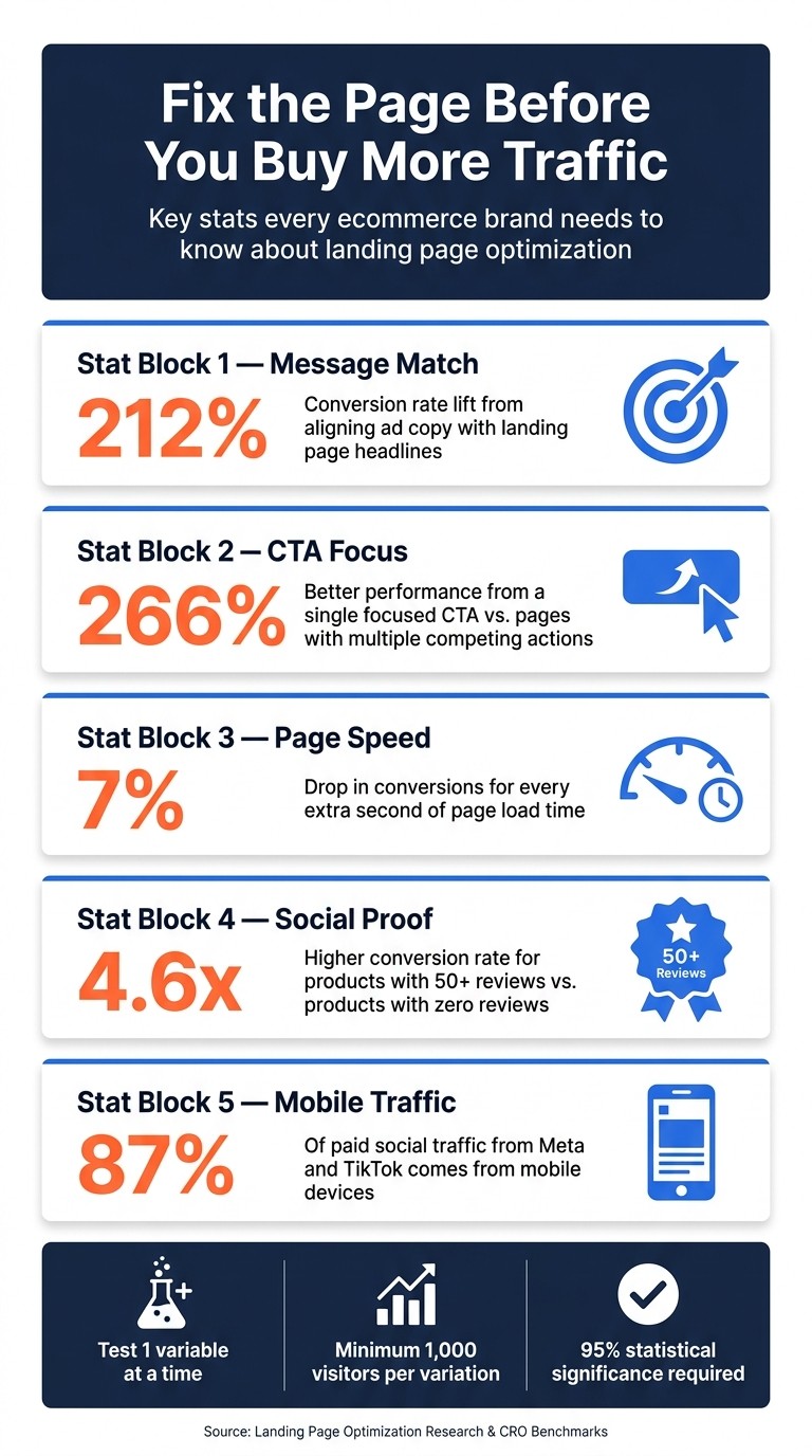
A few numbers make the case clear:
Better ad-to-page message match can lift conversion rates by 212%
A single clear CTA can outperform pages with many actions by 266%
Every extra second of load time can cut conversions by about 7%
Products with 50+ reviews can convert 4.6x higher than products with no reviews
If I had to boil the whole process down to one idea, it would be this: fix the biggest leak before you buy more traffic.
Ecommerce Landing Page Optimization: Key Stats & Impact Numbers
How to Optimize your E-commerce Landing Page (and make more sales)
Diagnose Where Your Landing Pages Lose Buyers
Start with the baseline metrics from the last section and trace where the funnel starts leaking. Before you touch copy, layout, or offers, use channel, device, and behavior data to spot the first major drop-off.
Break Down Performance by Traffic Source in GA4 and Shopify
Traffic sources do not behave the same, so your analysis shouldn’t either. In GA4, segment landing page reports by traffic source - paid social, organic search, and email - then compare add-to-cart rate and conversion rate side by side.
You’re looking for the pages, channels, and devices where buyers stop moving forward: product views, add-to-carts, and purchases. Two patterns show up again and again:
Low add-to-cart usually points to message mismatch or an unclear hero section.
High add-to-cart, low purchase usually points to trust issues or checkout friction.
That first gap matters. Aligning ad copy with landing page headlines can increase conversion rates by 212% [1].
Then bring Shopify revenue data into the picture alongside GA4 behavior metrics. That makes it easier to see which collection pages, product pages, or campaign pages are dragging down sales. Since paid social tends to skew mobile, compare mobile and desktop bounce rate and load time on their own. A page can look fine on desktop and still fall apart on a phone.
Once the data shows where buyers drop off, session recordings help explain the reason.
Use Heatmaps and Session Recordings to Find Mobile and UX Friction
Analytics show what is happening. Heatmaps and session recordings show why. Use Hotjar or Microsoft Clarity for click maps, scroll depth, and session recordings.
Review at least 50 mobile sessions on your highest-traffic pages [1]. Watch for patterns like rage clicks, dead clicks on noninteractive elements, tiny size or color selectors, and CTA placement outside the thumb zone. These are the small things that quietly kill momentum.
Pay close attention to users who jump straight to the footer looking for shipping or return details. That usually means key buying info isn’t visible where people expect it. A scroll drop-off above 30% near the top of the page can point to a weak value proposition above the fold [5].
It also helps to pair this with a short on-page poll. Numbers tell part of the story, but buyers often tell you the rest in plain English.
Build a Landing Page Scorecard to Prioritize Fixes
Once you’ve spotted the patterns, turn them into a simple scorecard. This gives you a clean way to rank pages and avoid wasting time on low-impact tweaks.
Scorecard Category | What to Evaluate | Target Benchmark |
|---|---|---|
Message Match | Alignment between ad copy and landing page headlines, visuals, and offers | 8/10 or higher [1] |
Above-the-Fold Clarity | Outcome-focused headline, subheadline, hero visual, CTA, and trust signal visible above the fold | All elements present [1] |
Page Speed (LCP) | Largest Contentful Paint on mobile | |
Trust Signals | Number and placement of reviews, guarantees, and badges | 3–5 strategically placed elements [1] |
Mobile Usability | Tap targets, font sizes, and layout stability on mobile | Tap targets ≥ 44×44px [5] |
Offer Clarity | Price, discount, and value proposition visible at a glance | Immediately visible [1] |
Focus first on high-traffic pages with low scores and weak conversion rates. That’s usually where the biggest revenue gap is hiding.
Improve Messaging, CTAs, and Offer Presentation
Use the scorecard to fix the pages with the weakest message match, offer clarity, and CTA performance first. Start with the pages that scored lowest on message match, offer clarity, or mobile friction.
Match Headlines and Hero Copy to Search, Ad, and Email Intent
If the data shows add-to-cart drop-off, start with the headline and hero. Each traffic source arrives with its own expectation, and strong message match between an ad and a landing page can lift conversion rates by 212% [1].
Rewrite the landing page headline so it mirrors the main benefit from your top-performing ad or email subject line. Match the offer to intent. Cold traffic usually needs reassurance. Retargeting responds better to a stronger offer. Email and search visitors tend to convert better when friction stays low.
For the hero section, keep it simple and direct: an outcome-focused headline, a subheadline that handles the main objection, a product-in-use photo, and one CTA [1]. Visitors should know what the product is, who it is for, and why it matters within five seconds of landing [4]. "Sleep 2 Hours Longer Every Night" beats "Premium Bamboo Sheets" because it answers the buyer's actual question.
Make Product Details Easy to Scan and Prices Easy to Understand
After the hero, buyers look for specifics. Use bullet points that lead with benefits instead of features:
"Feels noticeably cooler on warm nights" works better than "400-thread-count cotton."
"Helps cut tossing and turning" says more than a fabric spec alone.
"Easy to wash and stays soft" gives shoppers a plain-English reason to care.
That shift keeps the value clear without forcing shoppers to decode product language.
On mobile, price is one of the first things people check before they scroll any farther. Put the price above the fold as $49.99. If there's a discount, show the original and sale price together. Make the free shipping threshold visible early - "Free shipping on orders over $50" - so shoppers understand the offer before they reach checkout. Price clarity here has a direct effect on add-to-cart rate.
Use One Primary CTA and Test Variants Systematically
Once the offer is clear, drive one action. Landing pages built around a single CTA focus convert 266% better than pages with several competing actions [2]. Pick one main action per page - Add to Cart or Buy Now - and repeat it at key scroll points: above the fold, after the benefits section, after social proof, and at the bottom of the page [1].
Button copy matters more than many teams expect. Outcome-focused CTA copy beats generic options by 28% to 41% [1]. Here's how the main styles compare:
CTA Copy Style | Example | Clarity | Urgency | Perceived Risk | CVR Impact |
|---|---|---|---|---|---|
Transactional | Buy Now / Shop Now | High | High | High | Baseline [1] |
Mechanism-Based | Add to Cart | High | Low | Medium | –10% vs. baseline [1] |
Outcome-Focused | Get Clearer Skin | High | Medium | Low | +40% vs. baseline [1] |
Ownership-Based | Claim My [Product] | High | Medium | Low | +36% vs. baseline [1] |
Low-Commitment | See If It's Right For You | Medium | Low | Very Low | High for cold traffic [1] |
Run each test until you have at least 500 conversions. Pair the button with a one-line guarantee right above or below it - something like "30-day no-questions-asked returns" - since a clear guarantee can increase conversions by 15% to 23% [2].
Fix Speed, Mobile UX, and Trust Signals That Block Purchases
When message match is strong but conversions still stall, the problem usually comes down to three things: page speed, mobile experience, and trust near the buying moment. In other words, the pitch may be working, but the page still has friction.
Cut Load Time With Image, Script, and Core Web Vitals Fixes
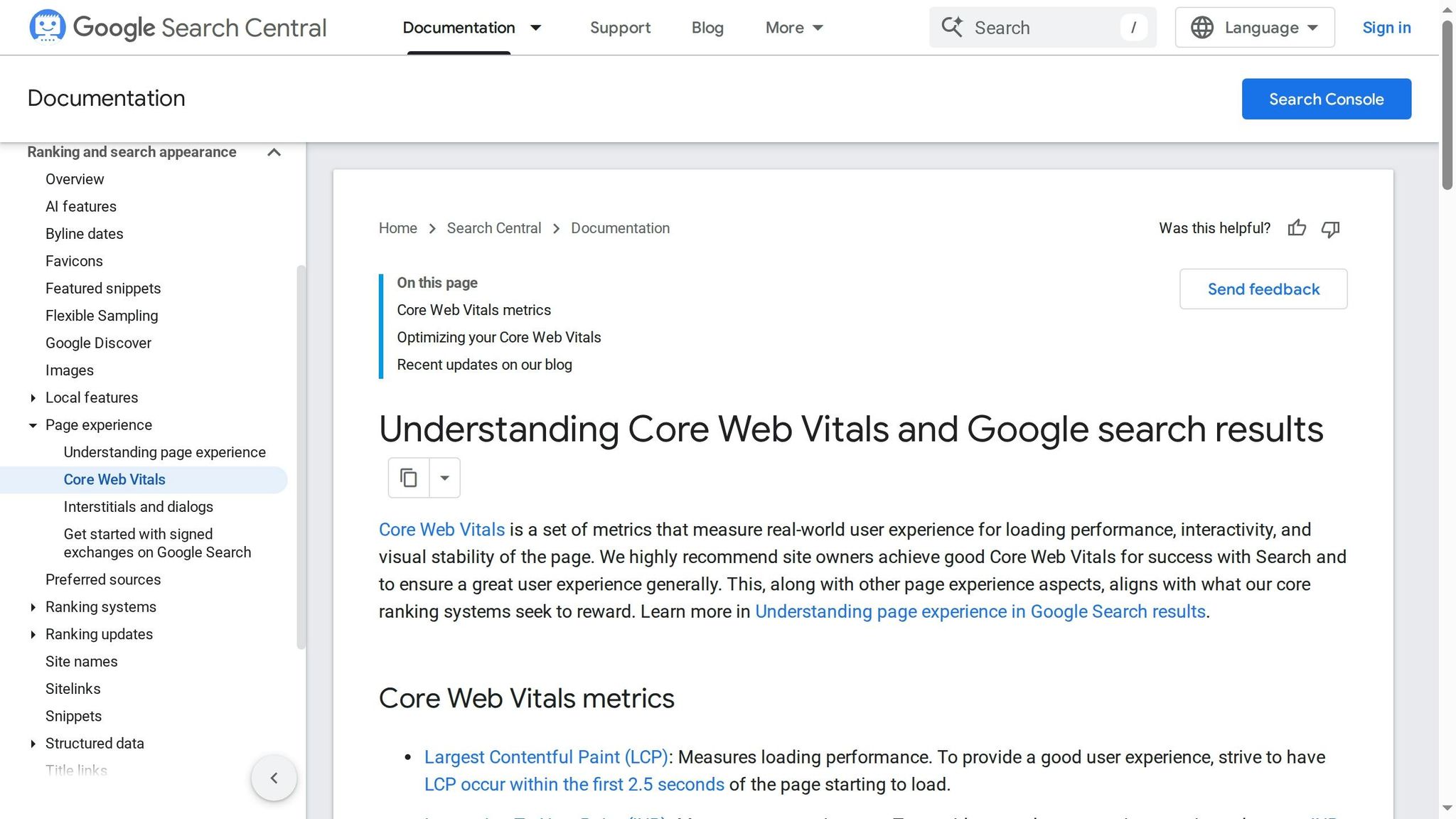
Start with PageSpeed Insights or Lighthouse to see where time is slipping away. Focus on the three Core Web Vitals that matter most: Largest Contentful Paint (LCP), Interaction to Next Paint (INP), and Cumulative Layout Shift (CLS). The targets are clear: keep LCP under 2.5 seconds, INP under 200 milliseconds, and CLS under 0.1 [1][3].
The usual troublemakers are pretty predictable: oversized hero images, scripts that hold up rendering, and heavy background videos that aren’t compressed. A few fixes tend to do the most work:
Compress hero images to under 200 KB and convert them to WebP. That alone can save 1 to 2 seconds.
Defer noncritical JavaScript, remove unused apps, and lazy-load media below the fold [1][2][3].
Every extra second of load time cuts conversions by about 7%.
Design Mobile-First Product and Campaign Pages
About 87% of paid social traffic from Meta and TikTok comes from mobile devices [2]. That means if the page feels clunky on a phone, most of your paid traffic is hitting a wall before it even reaches the offer.
Build for thumbs, not desktops shrunk onto a small screen. Use a sticky "Add to Cart" button, keep tap targets at least 44×44 px, strip out the main site navigation on dedicated landing pages, and skip pre-purchase pop-ups asking for an email before someone is ready to buy. On mobile, small annoyances add up fast.
Place Reviews, Guarantees, and Policy Details Near the Buying Decision
Trust signals do their job only when shoppers can see them at the moment they’re deciding. Put proof next to the price and CTA, not buried in the footer where almost nobody looks.
Products with 50+ reviews convert 4.6x higher than products with zero reviews [5]. Be specific. "2,847 five-star reviews" lands harder than a fuzzy line like "thousands of happy customers." For cold traffic, lead with reassurance and proof. For warmer traffic, stronger offers and urgency can carry more of the load.
Use these fixes as the baseline before testing one change at a time.
Run A/B Tests and Build a Repeatable Optimization Workflow
Once the page basics are fixed, optimization should become a steady testing loop, not a one-time cleanup job.
Write Test Hypotheses and Measure Revenue-Focused Outcomes
Start with the pages that show the most friction in GA4, Shopify, and Hotjar. Those pages usually tell you where money is leaking first.
Each test needs a clear hypothesis: "Changing [variable] to [variant] will increase [metric] because [reason]." That simple structure keeps the test tight and makes the result easier to read.
Test one variable at a time. Change the headline, hero image, CTA copy, offer framing, or social proof placement - but not all at once. Split traffic 50/50, let the test run for at least 2 weeks, and aim for 95% statistical significance with a minimum of 1,000 visitors per variation [3]. Only 12% of A/B tests hit statistical significance in under 7 days [3], so calling a winner too early is one of the fastest ways to fool yourself.
Judge performance by revenue-focused metrics:
Add-to-cart rate
Conversion rate
Average order value (AOV)
Revenue per session
Use bounce rate, scroll depth, CTA clicks, and time on page as diagnostic signals inside GA4 and Hotjar. They help explain behavior, but they shouldn't be your main success metric.
Traffic source matters too. Cold paid social or search traffic often needs more education and stronger social proof. Warm email or retargeting traffic can usually handle less friction and more direct CTAs [1].
Test Variable | Primary Metric |
|---|---|
Headline & Hero Copy | Conversion Rate, Bounce Rate |
CTA Copy & Placement | Click-Through Rate, Add-to-Cart |
Hero Image vs. UGC Video | CVR, Time on Page |
Social Proof Placement | CVR, Time on Page |
Offer Framing | AOV, Revenue per Session |
Navigation Removal | CVR, Exit Rate |
Go after the highest-traffic pages first, then work through tests one by one. Small copy changes can move the needle more than most teams expect. Outcome-focused CTA copy like "Claim My Discount" instead of "Shop Now" can beat generic copy by 28–41% [1]. On cold-traffic pages, removing the navigation menu often lifts conversion rates by 15–35% [1].
Use Averi to Speed Up Landing Page Copy and Experiment Workflows
When making variants starts slowing down your test cadence, bring in AI to speed up drafting and organization.
Use Averi to generate on-brand headline and CTA variants, then track hypotheses, edits, and winning versions in one workspace. That kind of documentation helps turn isolated wins into repeatable templates you can use again for product launches and seasonal campaigns.
Conclusion: Start With the Highest-Impact Fixes First
Once tests are live, the job changes. You're no longer just fixing pages - you’re stacking wins over time.
The playbook is simple: diagnose by traffic source and behavior, fix message clarity, sharpen CTAs and offers, improve mobile speed and trust, then test in a steady rhythm. Even a 1-point lift in conversion rate can have a meaningful effect on revenue without adding more traffic.
Use GA4, Shopify, Hotjar, and Averi to spot friction, rank fixes, and document each test so the next one takes less effort. Start where the clearest friction shows up, fix that first, and keep the loop moving - turning more of your current traffic into product views, add-to-carts, and purchases.
FAQs
Which landing page fix should I make first?
Start with message match. Your landing page headline and core message should line up with the ad or offer that brought people there. When the page feels like a direct continuation of the click, conversions often improve fast.
Next, remove navigation on landing pages built for paid traffic. Extra links give visitors easy ways to leave before they take action. Those two changes fix the biggest leaks first and give you a stronger base for more testing.
How much traffic do I need before A/B testing?
A solid starting point is 1,000 visitors per variation and 500 conversions per variation. Let the test run for at least 2 weeks, and aim for 95% confidence.
For paid traffic, that usually means buying enough visits to hit those conversion numbers. Organic or retargeted traffic can sometimes get there with fewer visitors, but the main target doesn’t change: you need enough conversions to measure lift with confidence.
What should I optimize on mobile first?
Start with mobile load speed and responsiveness. Your landing page should load in under 2.5 seconds. That benchmark matters: every extra second can cut conversions by about 7%.
Put most of your effort into the usual trouble spots. Compress images, lazy-load them where it makes sense, and pay extra attention to heavy hero images that can drag down the first view. Strip out render-blocking CSS and JavaScript so the page can show up faster instead of making people wait on code they don't need right away.
Then test it the way people will use it. Check the page on real mobile devices and under real network conditions. Lab tests help, but they won't always catch slowdowns, layout shifts, or those annoying moments when a page looks ready and then suddenly jumps around.
Related Blog Posts

Zach Chmael
CMO, Averi
"We built Averi around the exact workflow we've used to scale our web traffic over 6000% in the last 6 months."
Your content should be working harder.
Averi's content engine builds Google entity authority, drives AI citations, and scales your visibility so you can get more customers.